Brand identity style guide
LEARN HOW WE BUILD A BRAND AND DELIVER VITAL INFORMATION TO THE CLINET ON HAND OVER
This brand style guide establishes rules for the visual presentation of the brand, including colours, typography, and elements used. This guide ensures consistency in brand representation across all channels and materials, helping to maintain brand recognition and create a strong brand image. It is used as a reference for both internal and external parties to ensure accurate and consistent brand portrayal in all communications.
The final design
I worked closely with the customer going back and forth doing multiple tweaks and revisions in order to get the best possible result. The goal was to create a minimal design with no gimmicks, focusing on digital tech with a modern clean design that can be used across all media outlets.


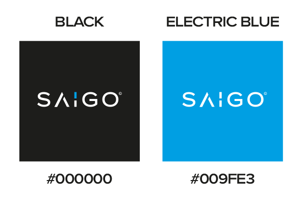
Colour Palette
Having a well-thought-out logo colour palette is essential for creating a cohesive and visually appealing brand identity. The colours chosen should reflect the brand’s personality and evoke the desired emotions or associations with the target audience. Consistency in using the logo colour palette across various brand assets helps in establishing brand recognition and building a strong brand presence.


Icon Draft
Consistency is the key when drafting out logo designs ensuring all spacing and sizing are the same throughout the design.

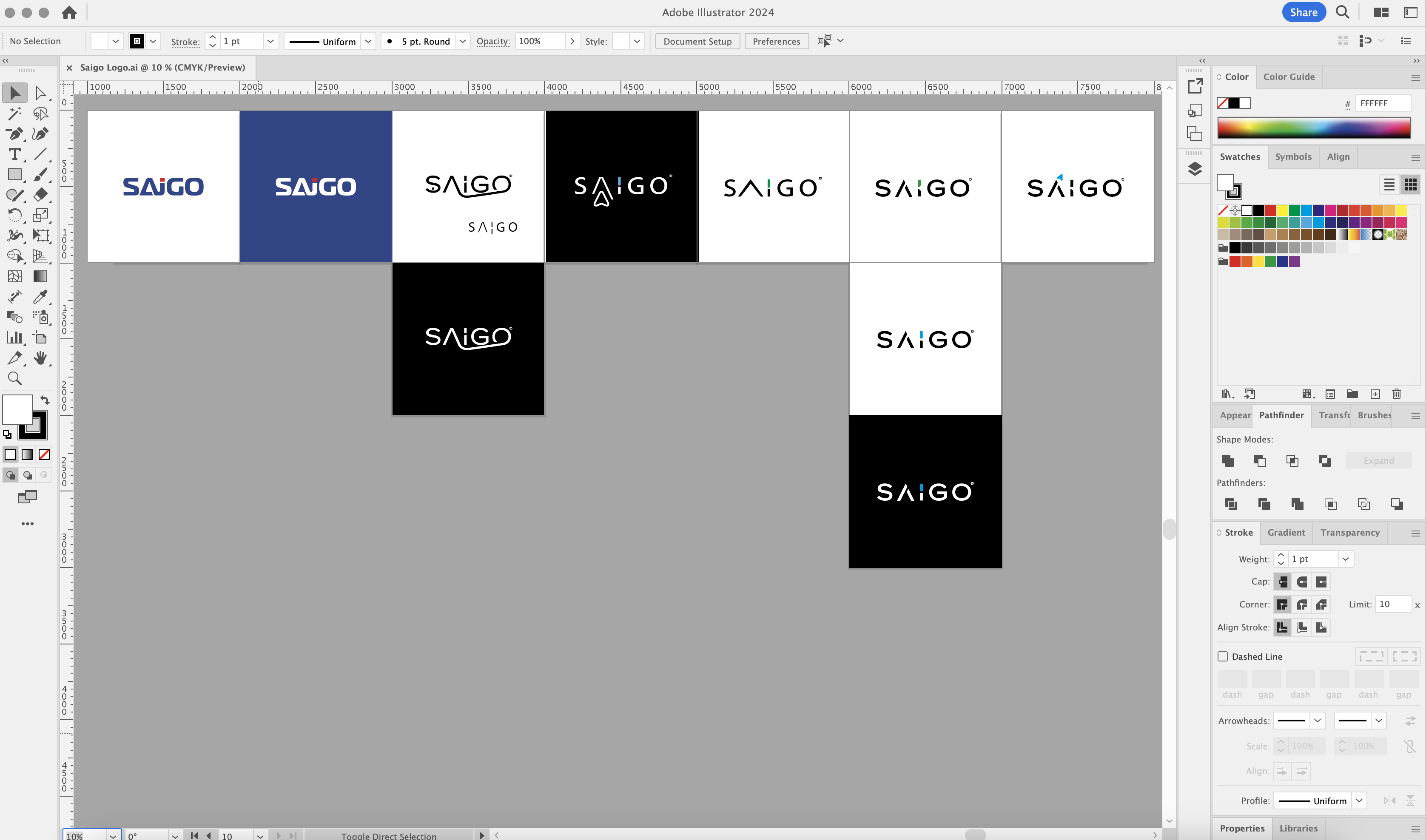
Tweaks & Revisions
Here you can see the design process and progress which leads to the final design.

Another happy customer
After all the hard work, the crucial part of the whole process is that the customer is 110% happy.
Let’s Work Together
TELL ME MORE ABOUT YOUR PROJECT
If you get stuck or would rather a chat please don’t hesitate to contact me on 07507784267